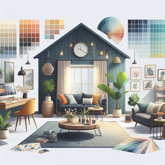
How to Choose the Perfect Color Palette for Your Home
Selecting the right color palette is one of the most important aspects of interior design. The colors you choose set the tone for your space, influencing mood, energy levels, and even how spacious or cozy a room feels. With so many options, it can be overwhelming to know where to start. Here’s a step-by-step guide to help you choose the perfect color palette for your home.
Consider the Mood You Want to Create
The first step in choosing a color palette is to think about the mood you want to create in each room. Different colors evoke different emotions. For example, cool colors like blues and greens tend to create a calming atmosphere, making them perfect for bedrooms or bathrooms. Warm colors like reds, oranges, and yellows are energizing and work well in social spaces like kitchens and living rooms.
If you’re designing a home office, you might want a color that promotes focus and productivity—think soft greens or light blues. In contrast, for a relaxing reading nook or meditation space, soothing neutrals like beige, cream, or pale gray can help create a peaceful environment.
Assess the Natural Light in Each Room
Natural light plays a significant role in how colors appear in a space. Rooms that receive plenty of sunlight can handle darker, bolder colors, as the light will prevent the space from feeling too enclosed. In contrast, rooms with less natural light will benefit from lighter hues that can help brighten the space.
Before settling on a color palette, observe how natural light interacts with the room at different times of the day. This will help you determine whether to choose cool or warm tones, as well as how intense your colors should be.
Use the 60-30-10 Rule
One tried-and-true design principle for color palettes is the 60-30-10 rule. This guideline suggests that 60% of the room should be dominated by a primary color, 30% by a secondary color, and 10% by an accent color. For example, in a living room, the walls (60%) might be a soft neutral, the furniture (30%) in a complementary color, and throw pillows or artwork (10%) adding a pop of vibrant color.
This rule ensures a balanced and cohesive look, allowing you to mix different shades without overwhelming the space.
Choose Complementary or Analogous Colors
The color wheel is a helpful tool when choosing a color palette. Complementary colors—those that are opposite each other on the wheel, such as blue and orange—create a dynamic, high-contrast look. Analogous colors, which are next to each other on the wheel, such as blue and green, offer a more harmonious and soothing effect.
Experiment with both types of color schemes to see what suits your personal style and the overall feel of your home. If you prefer bold, vibrant spaces, complementary colors might be the way to go. If you want a more relaxed atmosphere, stick with analogous colors.
Test Before You Commit
Before committing to a color, always test it in the space. Paint swatches on the wall and observe how the color looks in different lighting conditions throughout the day. What looks perfect in artificial lighting may not have the same effect in natural light. This simple step can save you from making a costly mistake and ensure that your chosen palette works well in the room.
Choosing the right color palette doesn’t have to be daunting. By considering the mood you want to create, assessing the natural light, and following design principles like the 60-30-10 rule, you can craft a space that feels both cohesive


